
 Facebook
 X
X
 Pinterest
 Copy Link
By Dana Gutwein
Recently, we worked with a set of sellers who didn’t just want to list their home as-is. They were willing to invest a little up front with the goal of selling at a higher price point. So before we did anything, we sat down and calculated the return on investment for each possible improvement, using our AI ROI tool alongside our own experience and both national and local market data. The goal: spend only on the items with the strongest expected return for their specific home.
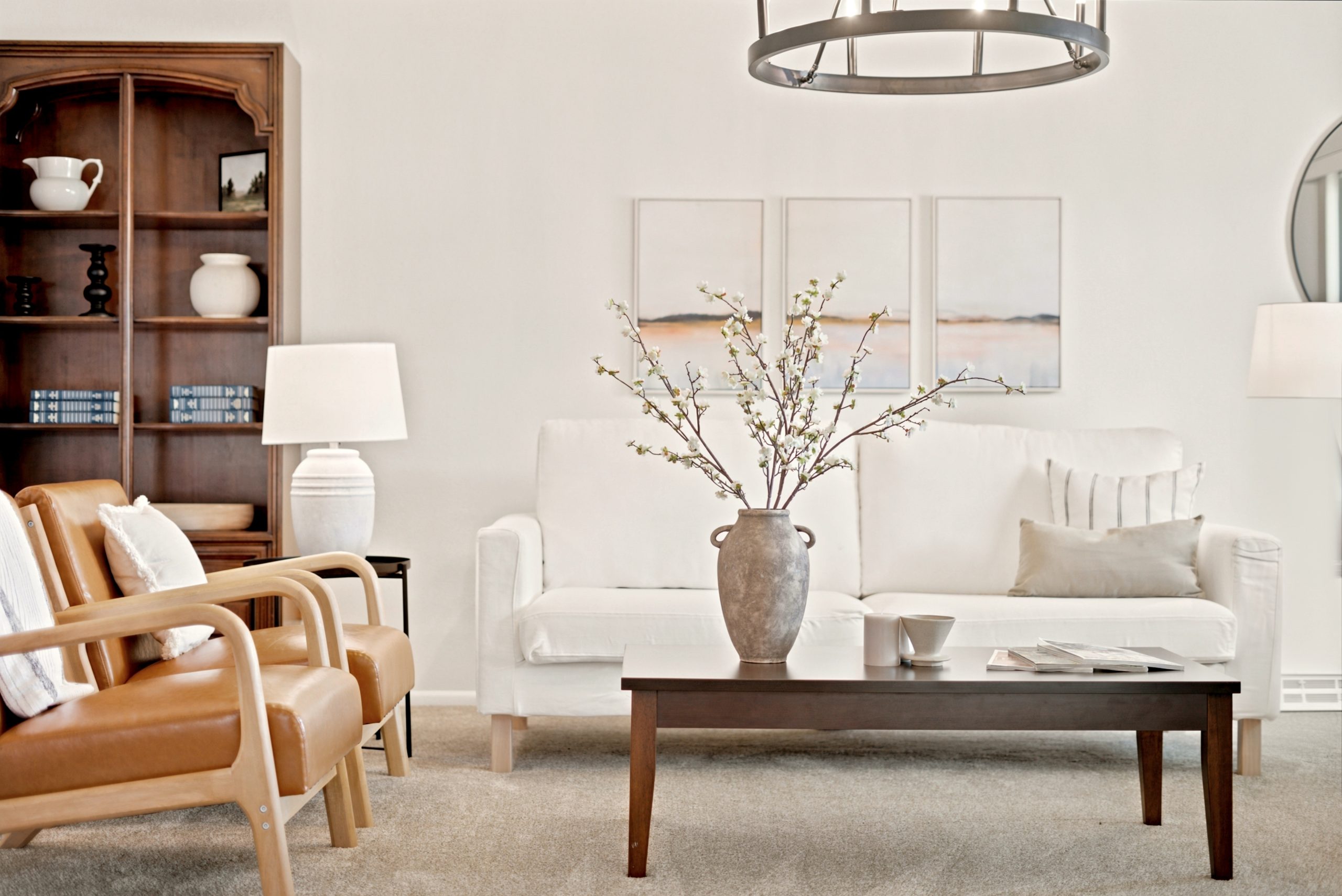
Near the top of that list, no surprise, was paint.
The result? A round of strategic prep — fresh paint, updated floors and lighting, and our signature curb appeal boost — set the stage, and paired with our team’s marketing, expert negotiation, and full staging, the home went under contract in just four days and closed in ten.
First, a little honesty about paint
Choosing a color can cause a surprising amount of stress. And I get it — there are hundreds (thousands?) of shades of white, cream, and beige out there. The pros will tell you to paint a sample, live with it for a few days, and look at it in different light. That is good advice. But when you’re trying to move and get your home ready to sell, I wouldn’t necessarily recommend pouring all your creative energy into finding the one perfect shade.
Instead, I’d recommend sticking with what’s popular. And I have a few reasons why.
Remember what you’re actually doing right now
We’re getting your home ready to sell — we’re not building your dream home at this stage. That matters, because when you’re selling, you want broad appeal. Broad appeal means more interested buyers, and more interested buyers can drive up demand. It’s simple supply and demand: the more people who can picture themselves living there, the better your position.
A color you personally adore might thrill one buyer and turn off five. A well-chosen popular neutral rarely turns anyone off.
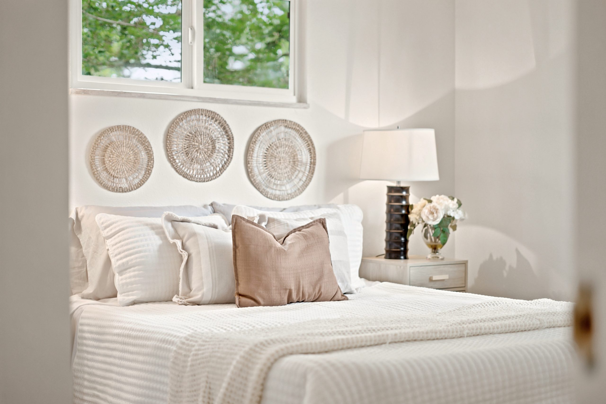
Popular colors are popular for a reason
They’re popular because they work. They’re forgiving. They’ve been tested in thousands of homes. They look good in daylight and at night. And they play nicely across different wood tones, flooring, and furniture — which matters, because you’re probably not replacing your floors and furnishings before you list.
My personal favorite is a warm neutral — and honestly, cream is my top pick. Light colors tend to make a home feel bright, airy, and bigger, which is exactly the impression you want a buyer to walk into.
Even the trendsetters are going neutral this year
Here’s a fun bit of validation: for the first time ever, Pantone named a soft white — Cloud Dancer — its Color of the Year for 2026. They described it as “similar to a blank canvas,” a symbol of “our desire for a fresh start.” Sherwin-Williams and Benjamin Moore both landed on warm, earthy neutrals for the year too.
Translation: clean, calm, and neutral is having a real moment. When you go this route to sell, you’re not playing it safe — you’re right on trend.
But what about all the moody colors I keep seeing?
I hear you — and I love them too. I’ve seen the trend pieces, the color-drenched rooms, even the Zillow article about brown bedrooms. Those spaces can be gorgeous.
But here’s something to keep in mind.
I’d bet most of those stunning rooms had an interior designer, or someone who spent a lot of time carefully selecting exactly the right shade, because moody color is genuinely easy to get wrong.
When you work with a color like brown, or even charcoal or sage, the sunlight in the room, your furniture, your ceiling and trim color — and especially the colors in the surrounding rooms — can all shift how that paint reads on the wall, or make it clash outright. And when you’re getting ready to sell, you’re most likely not also planning to swap out your throw pillows, sofa, artwork, and rugs to make it all work together. So it’s both hard to execute and hard to justify the cost.
And then there are wood tones. I can practically watch people’s eyes glaze over — or their pulse quicken — the second I bring them up, because that’s when the stress really compounds. Your floors, your cabinets, your trim, your furniture legs all carry undertones that have to get along with your wall color. So here’s my honest plea: if color-matching to your wood tones sounds like a nightmare, please don’t try to pick a bold color. A warm neutral quietly gets along with all of it.
Save the fun colors for decorating your next home. When you’re getting ready to sell, stick with what goes with what you already have, what has broad appeal, and what’s easy.
A quick note on gray
I’m a millennial, and yes — I went through my millennial gray phase. I still love a great gray; it is still a gorgeous color. But here’s my one caution: if you have gray floors or gray-toned flooring, I’d really encourage you to lean more cream than gray on your walls. The younger homebuyers are over the all-gray, cooler look — and cream on your walls plus a warm textile (like a throw or a rug) can instantly warm up and modernize your room, increasing your appeal.
This is exactly why cream is such a foolproof, safe choice: it’s neutral enough to work with cooler tones, it warms up all of us who went all-in on gray, and it plays beautifully with classic styling and just about any furniture you already own.
What I chose for this home
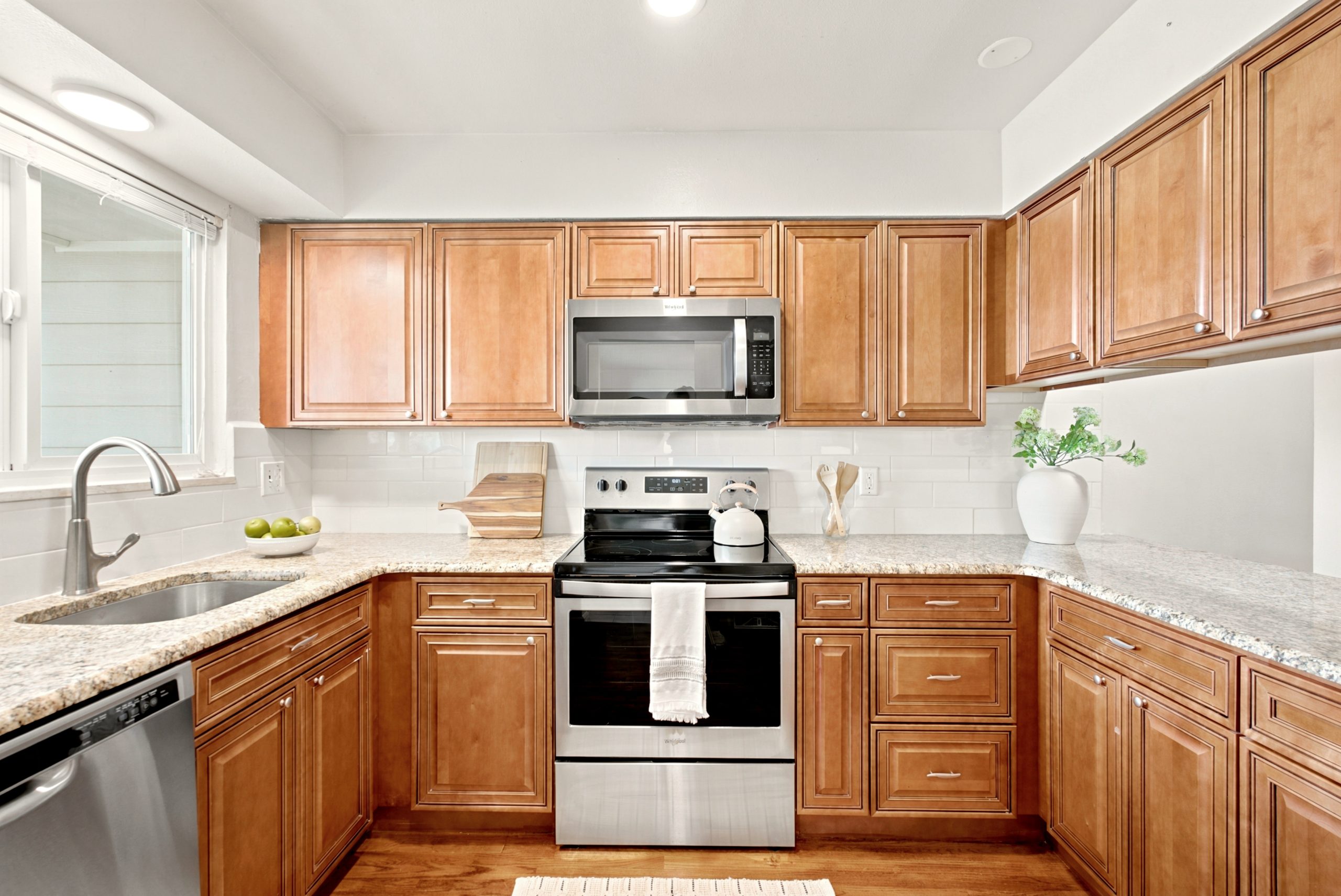
So what did we land on for the sellers I mentioned? Swiss Coffee — a soft, creamy neutral. And I picked it for three very practical reasons:
-
It’s one of the most popular, most forgiving creams out there — broad appeal, tested, easy on the eyes in any light.
-
It was already on the kitchen walls, which kept the whole home cohesive and let us skip repainting the kitchen entirely — it was already in good condition, so that saved real money.
-
It blended beautifully with the slightly different cream-beige already on the dining room walls — which meant we didn’t even need to repaint that room.
Popular, cohesive, and less work. That’s the trifecta — and it’s exactly the kind of thinking that makes prepping to sell feel a whole lot lighter.
If you’re getting your home ready to sell and feeling overwhelmed by where to start, let’s walk through it together. We’ll map out the improvements with the strongest expected return for your specific home.
Call or text LaDawn at 720-915-2619 — whatever works best for you.
About Us
LaDawn Sperling, REALTOR® with Coldwell Banker Realty, provides full-service home staging and listing prep for her real estate clients across the west Denver metro area — including Lakewood, Wheat Ridge, Arvada, Littleton, Golden, Evergreen, Morrison, Englewood, Westminster, and Highlands Ranch. Home staging, design, and project management is led by Dana Gutwein, our team designer. Contact LaDawn with questions about how we can help prepare your home for success.
