
 Facebook
 X
X
 Pinterest
 Copy Link
Written and designed by Dana Gutwein
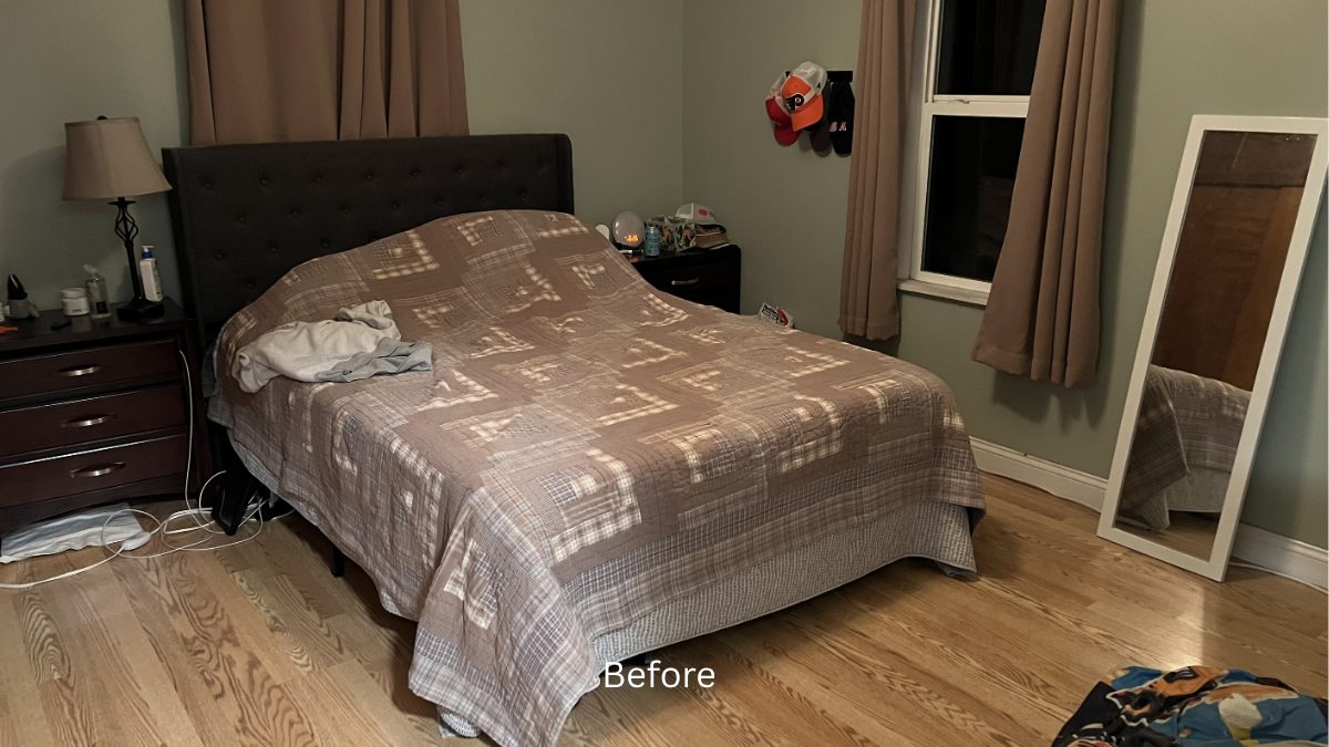
This week we are breaking down a recent vacant staging in Lakewood– and this one was such a fun challenge.
This home went under contract in just three days, with multiple offers. It had so much going for it- great natural light, beautiful, large windows, gorgeous xeriscape, proximity to parks and open space, larger lot with mature trees.
I also bumped into a couple of design challenges along the way. Finding solutions that highlight the best parts of a home is one of my favorite parts of the job— so let’s walk through it.
Reframing the Space… From Sunroom to Entry
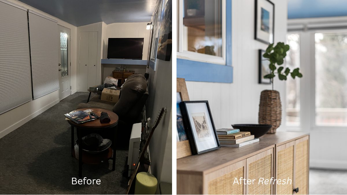
One of the most interesting parts of this home was a sunroom addition the front, with windows all along the exterior. It’s the kind of space you can immediately imagine enjoying- reading, relaxing, soaking in the Colorado sky.
But, the way a home lives and the way it photographs are not always the same.
This room is longer and narrower than a typical living room, almost like a spacious hallway, so when staged with seating, it read a bit confusing in photos. Identifying a clear purpose for this room that fit in this layout was my first fun challenge.
After considering multiple options, I decided to stage it as an entryway instead— aligning the scale and flow of the room, and giving me the chance to make a fantastic first impression.
I wanted people to open the door and feel: “I love it here…” the moment they walked in.
To create that feeling, I focused on scale, symmetry and a color palette that worked with the blue accent. The large round mirror balanced with the pair of black frames, centered by these two fun consoles. I finished it off with a hallway runner, and made sure there was something visually interesting along the far corner – subtle seating and a large plant – so that your eye naturally moves through the space and into the home.
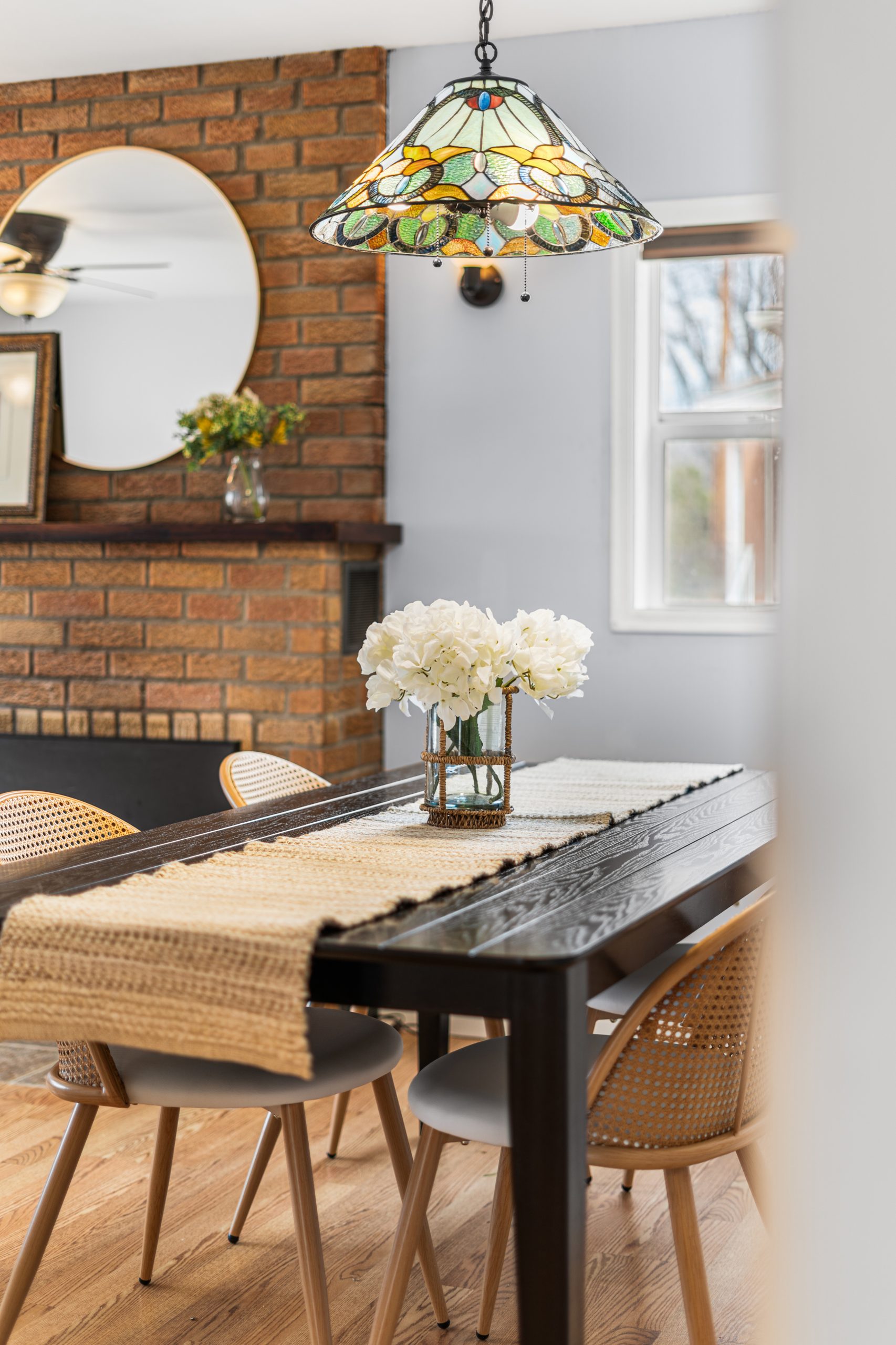
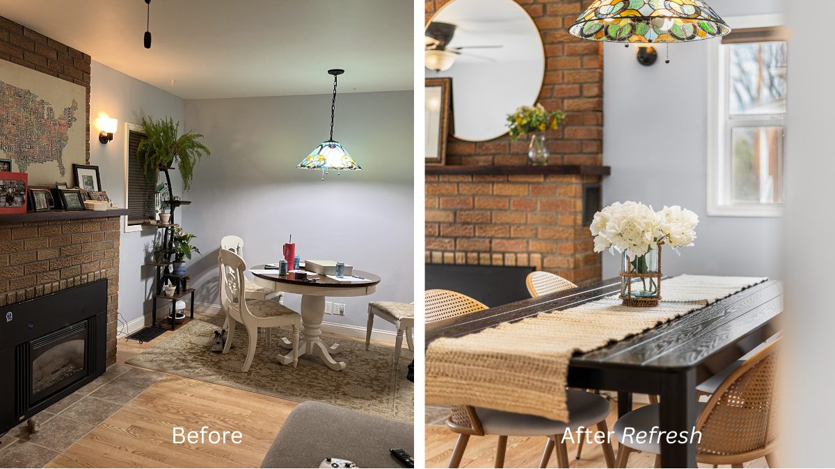
Living / Dining
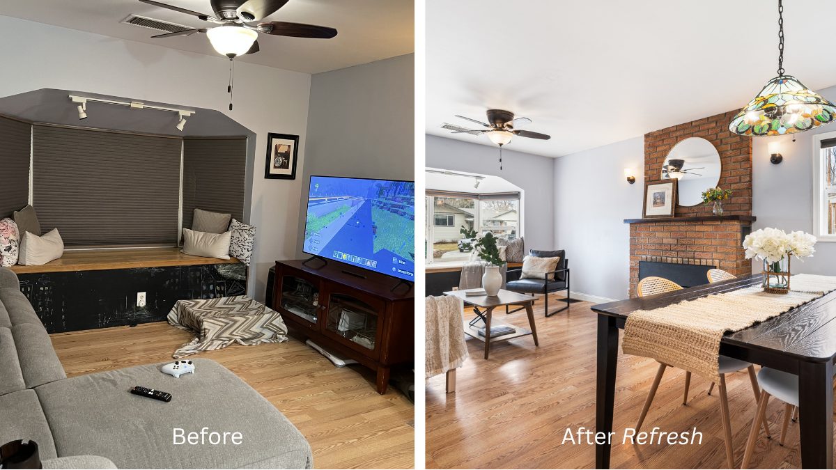
This space felt naturally ready for entertaining, with the kitchen opening into a combined living/dining area. Two standout areas — the bay window and the brick fireplace- gave us strong focal points to built around.
I added a large round mirror with gold frame to reflect light and soften the brick, and layered artwork (thrifted frame, printed art on canvass) and small floral arrangement for warmth and interest. For the bay window, I made a cushion using a roll of foam and a simple linen fabric, then added plenty of throw pillows- something that could feel just as natural for a morning coffee as it would for extra seating during a gathering. I chose a white sofa – always a great choice for staging because it photographs beautifully and keeps things feeling light and open, then grounded the space with a darker wood coffee table and accent chair for contrast.
A Quick Note on Scale
Here’s where I ran into a second scale challenge. Scale is one of the most important parts of staging. If the furniture is too large, it can make the room feel cramped or smaller than it actually is. If the furniture is too small, it can feel underwhelming, or unfinished.
I intentionally selected a slightly smaller dining table, maximizing flow and allowing the room to read larger, overall. But, once everything was in place, I realized I had neglected to factor in the scale of the overhead light fixture- it was nearly the same size as the table, which threw the balance of the room off.
With a tight timeline and limited inventory, I ended up sourcing a new table last minute that better matched the scale of the space from Facebook Marketplace (and included a quick trip to Evergreen.)
It wasn’t a perfect match to the woven chairs I had purchased for this project at first – so I added a textured runner and simple floral to tie it all together. The contrast ended up working in our favor and added depth, and the slightly longer table subtly showed buyers how much room they had in this space.
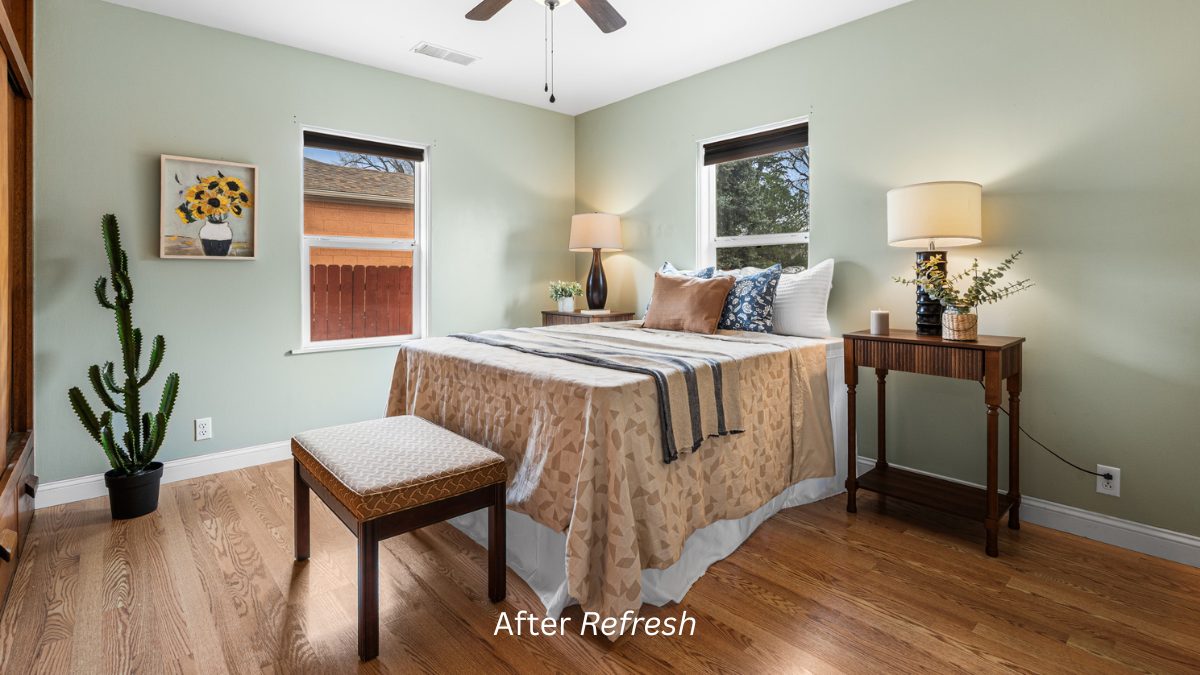
Bedroom
For the primary bedroom, I moved the bed and leaned into the soft green paint, keeping the pallet calm and cohesive with creams, warm wood tones, simple geometric patterns. I opted for matching nightstands here — the balance elevates the space since I chose not to add a headboard in front of the window.
One of my favorite little details in this room is the texture and color of the painting paired with cactus. Its a little unexpected, but it worked— and those are the kinds of moments I’m always looking to create. Something that catches your eye, adds a bit of personality, but still lets the home shine.
Staging Takeaways
- Scale, purpose and flow are the foundations of a successful staging
- Accessories, layers, texture, and shine are the icing on the cake
- Small styling moments can create a big emotional impact
One of my favorite moments from this project – one of the buyers actually asked if they could purchase all of the furniture along with the home, which is always the ultimate compliment. It means the space didn’t just photograph well, it truly connected.
As you can probably tell, I fall in love a little bit with a each of these spaces. At the end of the day, my goal is to do the same for the buyers because then I help the seller get the best possible outcome — and the buyer find exactly the right place for them.
What could be more fun than that?
About Us
LaDawn Sperling provides full-service home staging for her real estate clients in the Denver Metro Area, including Lakewood, helping prepare both vacant and occupied listings for today’s market. Home staging & design is led by Dana Gutwein, our team designer. Contact LaDawn with questions about how we can help prepare your home for success.
